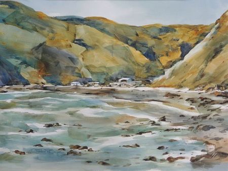
by Ted Sherwen
I paint mainly in transparent watercolour. This is by choice. I find it an absorbing and exciting medium and am passionate about it.
Like my fellow painters, regardless of medium I constantly strive to improve. Fine arts painting is hands on and watercolour is no exception. It has its own formal disciplines: The need to maintain an awareness of the white paper ground, simplification of images, and an ideal of executing the work in approximately three stages. This medium of the nursery can and does overwhelm. A painting does not have to have whites - a common misconception. However, integrated/interlocking whites held by saturate colour (tertiary or pure) with good edges is accomplished painting.
Awareness of white paper involves allowing the wavelength of white light to penetrate the watercolour layers and then reflect back in a secondary bounce. If you ignore this aspect of the physics of light intermixing/blending with thin layers of pigment on a white paper ground, you risk success in your painting. Less is indeed more.

I maintain and constantly use a study notebook/sketchbook. Watercolour lends itself to this.
I paint many 6x4 inch watercolour studies and regularly make pencil paintings in 2B, 4B & 6B.
I use the term pencil paintings because I am painting in graphite with no pre-drawing. I lay the graphite in broadly using artists pencils (USA), a flat lead similar to a carpenters pencil, but in 2B-6B.
I keep them very flat and very sharp. I save any graphite shavings to use for reinforcing darks. The results are geometric, painterly and invite a colour version.
I do not paint things I paint pattern.
Pattern is subject to the Rule of Seven (Rex Brandt): less than 7 units is pattern; over 7 it is texture/detail. Brandt with his genius for watercolour was renowned for his luminous work. He was an exceptional and generous teacher and, with his artist wife Joan Irving, was a very good friend.
Texture/Calligraphic detail is painted in one value plus or minus the value of its ground. Calligraphy reinforces a linear or a colour dominance. So the hip bone is connected to the knee bone and all roads lead to a unified/varied composition. The more one investigates, the more absurd is chocolate box painting or noughts and crosses for that matter!
Graphite pre-painting is a great device for combining information with composition. Critical images/icons are stepped around the composition in varying mini focal areas. We exaggerate and diminish selectively. Edges and gradation almost arrange themselves. Images are kept open to allow the eye to flow this is Passage or to quote Andr LHote (Post Cubist) a visual flux. The equation is open shape / open colour.
I am not a fan of local colour and tend to frown at an excess of same. I borrow from local colour but adjust it within a selected palette. I will aim for a colour dominance (or tonal dominance) eg: a green painting.
Similarly a work with dynamic whites and edges held in a maroon colour field with saturate shots of Burnt Umber, Permanent Rose and Black (made from Thalo Green/Permanent Rose) may have been preceded by a high key colourist palette containing three Blues, Lemon Yellow, Orange and Vermillion.
Watercolour on quality paper where one moves away from ones comfort zone is a high risk/high reward venture not for the faint hearted. Degas loved the dance, Lautrec loved the dancers and both could draw and paint.
As a modern painter in a contemporary world, where the palm leaf can be awarded for much ado about nothing, I am certain that one must serve ones apprenticeship. There are no shortcuts to attaining a trained fist that can paint from the elbow or the wrist.
Saturate colour (intense) and luminous darks should be sought. Edge hierarchy and gradation are paramount in the ideal of variety within unity. Gradation lends itself to watercolour. The eye loves gradation and follows it.
My target is completion in 3 stages employing the K.I.S.S. system. I often commence a watercolour with a broad soft edged underpainting wet into damp, painted up to strength with colour/tone (tertiary hues) allocated in anticipation of the next stages. Whites or linked whites allocated in the Arabesque or Passage is the main decision in Stage 1. Knowledge of pigment characteristics is essential.
The difficult painting stage is stage 2. I paint from the wrist/elbow in the first 2 stages, keeping an open mind, ready to adapt, to seize any opportunity presented as the work advances.
I like the modern definition:
It should be realised that a painting, before it is an anecdote for a horse or a tree, is a series of shapes and colours on a flat surface, arranged in a certain order.


