Edited by Sue Wild
I was astonished when, at one of my first committee meetings back in 2007, someone suggested that we should not arrange a painting trip to the Wairarapa in spring because it is too green! I learnt swiftly that some artists dont like green and some will not use it at all.
Art history tells that ancient civilisations had difficulty creating a durable green pigment, until synthetic dyes were produced in the 18th century. Green is the colour of nature, health, environmentalism, Go!. In contradiction it is also the colour of sickness and envy. Even Kermit said "Its not easy being green."
I asked three of our experienced artist members for their advice on mixing and using the colour green.
Brian Baxter
In perusing a selection of paintings on my studio walls I am surprised to find most of them contain very little green and several none at all. Why? I dont really know, because there are beautiful greens, some directly out of the tube and some from random mixing.
To the artists reading these columns I would certainly not claim to be able to give advice about colour mixing generally, especially with greens (and ESPECIALLY with watercolours). But apparently I am not the only one who has found green a challenge and hopefully my experience may be of some help or interest to others similarly challenged.
I personally have tackled greens in various ways, the first being the cowardly answer of eliminating it completely or nearly completely, substituting it with other more suitable or easy colours. The second is to modify it slightly, pushing it sideways on the colour wheel, one way or the other, until I have a more pleasing combination of colours.
The third is just muting it, depending on its importance in my overall composition. This, of course, can lead to a lifeless painting, which may be safe but not very exciting.
The fourth is to dive bravely into the yellows and blues and reds and browns and purples and oranges etc. and just see what happens! Sometimes it will be a disaster, but sometimes wonderful greens and magical analogous or complementary hues can emerge!
I have found that unexpected colours, including green, can occur in unexpected places, for instance in portraits, in skies, in shadows, in still lifes, in water etc. as well as more commonly, of course, in foliage.
I wish I was able to master the trick of pulling them all together successfully on one blank sheet of paper!
Alan Collins
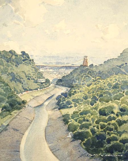
 The Clifton Suspension Bridge, Bristol
by Alan Collins
Firstly, may I introduce you to my paintbox. Its white plastic (no corrosion) with space for 12 whole pans. The only colours I use are Winsor Yellow, Winsor Red (avoiding the cadmiums), Alizarin Crimson, Winsor Blue (red shade), Ultramarine Blue, Cobalt Blue, Yellow Ochre and Burnt Sienna.
I dont have green in my paintbox. I mix it. I do have a tube of Viridian for early morn or evening skies or when painting English subjects. I tell this to all and recite it to myself: Paint what you see, not what you think you know. My paper: only 640 gsm Arches cold pressed. It is expensive but it takes a beating, scrubbing, lifting out, doesnt wrinkle and can be held by the corner while painting! Cheap paper is useless. When buying, purchasers expect permanence and should receive it.
Important in a scene is the amount of sun and where the light is coming from - conditions that come together to make an irresistible subject to paint. I find our hills to be a sort of khaki colour although during this summer more Yellow Ochre (Oh, my poor lawns). So lets get into it. Screw up your eyes until you can see only the basics - almost a visual coroners report on the scene. Look, observe. I use no camera, no photos.
When mixing your first wash, introduce some granulation. Granulation occurs when, in a wash, certain pigments separate and dry to look just like the texture of our hills manuka, beech or even gorse. Set the paper flat to dry. The heavy pigments fall into the valleys of the paper and the peaks of the paper starve. Ultramarine and Burnt Sienna granulate like crazy and to a lesser extent Cobalt and Yellow Ochre. Its not the colour Im looking for, its the granulation. Add colours to make the wash a similar colour to your subject.
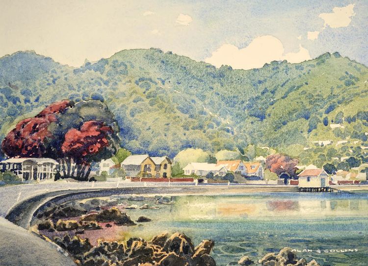
Now the shadows: I see a bluish tinge in outdoor shadows, especially bush, and blue adds distance. Mix that magic colour using Ultramarine and Burnt Sienna, quite watery and a touch of something else to adjust the colour. Holding your paper at about 45 degrees, paint the shadow pattern as you see it. The effect is quite remarkable. The top of the shadow will starve and the base will be stronger. Here are some examples to illustrate this.
If you are a beginner, have patience. If I make it sound easy peasy, its not, but after 90 years of watercolouring, I am beginning to get this wonderful medium to do as I wish. Good luck, have a go.
 Tis the Season
by Alan Collins
Phil Dickson
Green how to manage it
There has been much literature about artists fear of painting greens, and indeed if not handled with care they can look more awful in a painting than other colours. For landscape artists the problem is so often the sheer quantity of green in the subject! Fields, trees, hills. The best way to approach the subject is to see it in light and shadow, appreciating that tones are more important than colour. That is why plein air painting is so important; you observe nature first hand.
If there is lots of green in your subject, observe carefully the light and shade and the effects on colour of items in the foreground and how their tones and colour change as they recede into the background. Note that greens are no longer green in the distance. Remember, paint what you see, not what you know, or rather what you think you know! These observations apply to any colour, but greens are probably the hardest to manage.
For example if you were painting a subject featuring trees nearby and hills in the distance in bright conditions the trees in your foreground may look green. You may know that the hill in the distance is covered in forest, (maybe even the same types of trees as in your foreground). Therefore they are the same green, yes? Do they look the same? Even assuming the forested hills are catching the same light as the foreground, the tone and colour will be altered by the affects of the atmosphere between the foreground and the distance. As items recede into the distance they become lighter and usually more bluish, especially the greens. The tones when the atmosphere is dull or in shade change colours completely adding more challenges.
But to paint landscapes convincingly, observe nature first hand. Trees, foliage and grass nearby in sunny conditions reflect lots of yellow. Any modification to these yellows can be by adding a little yellow ochre or orange, or if a hint of green is justified, add either a tiny touch of green or blue. Often the top edges of foliage catching the sun take on bright yellow. The body of green within foliage is frequently an olive green.
In more recent years I have taken to having greens in my palette to supplement the blues and yellows. I find that I get best results by mixing greens from blues and yellows rather than using proprietary greens straight from tubes or pans. Colours such as Phthalo Green and Emerald are the most difficult when replicating nature; Hookers, olive and light greens are easier. But invariably even resorting to a proprietary green needs some mixing modification.
So I often use Cadmium Yellow, (or Cadmium free yellow) as the base of high-lit greens, sometimes with orange. For bulk tonal greens, one of my favourite mixes is Prussian Blue and Yellow or Gold Ochre.
Other blues I occasionally add to the mix are Phthalo and Cerulean. Another colour to add sometimes to the greens is red. For deep shadow areas add Indian Red.
Every painting experience needs individual attention, so the above mixtures are only a guide.


