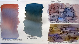
Watercolour is the perfect medium for creating subtle and varied greys/neutrals that provide a supportive backdrop to points of vibrant colour. I asked two of our respected artists for their advice on creating beautiful greys.
Adrienne Pavelka
When Sue Wild requested a greys theme for an article in the Newsletter, after agreeing, l realised that l dont actually deliberately mix greys they just happen when you blend and add colour on to wet paint.
Black, Paynes Grey and Yellow Ochre, often used to make grey, are pigments that, in my very humble opinion, should be given an indecent burial, if not flushed away.

We are all familiar with mud something that happens when you have mixed colours together trying to create a grey and have overworked a muddy puddle. Hint: drop in a blob of opaque cobalt lavender, turquoise or orange to give your puddle a ping.
Rocky outcrops, stone walls, shingle river braids, weathered fence posts and foggy skies are not grey. They are a rainbow of colours if you look closely with just a little imagination! ln my little example of a rock or stone wall, l have virtually slopped on a wash of Dragons Blood, Cobalt Blue and Purple in patches and let the colours merge, then defined the shapes with a hard pencil and finally glazed more unmixed colour onto damp paint where drying cauliflowers add to the rock texture. Otago schist stone also has its own colour scheme of Golden Lake and Purple.
For a wet west coast misty sky and trees, l would use Cobalt Blue and Raw Umber. For warm fog, Dragons Blood (Brown Madder) and Cobalt Blue. A wash of Indigo for a cool grey also works.
l do hope that there will be a great gathering at the Watercolour New Zealand Paintaway in Methven in
May.
Amanda Brett
To be truthful, for me, grey is the most frightening colour I dont wear grey, I dont like looking at it, I dont have it in my house and I hate grey cloudy days! So when I was told recently that my greys were greatly admired I was quite floored, this started a renewed process of investigation what greys do I create and how do I use them?
Firstly, many of the pigments are made from natural minerals and due to these natural qualities, react and bounce off each other, quite fun to watch and experiment with. Manufactured blacks and greys are mostly made from a kiln firing process therefore they contain soot. For large washes they can be lifeless and dull and often dry substantially lighter than expected.
Secondly, in watercolour, our staples are our complementaries (red vs green, purple vs yellow etc). For example, to neutralise red, I add a little green, a secondary colour containing blue and yellow, when I add green to red I have 3 primaries which means the greying process is started.
I prefer to paint with transparent watercolours so I select my palette carefully. Mostly I use Winsor & Newton pigments and then I add opaque pigments for accents. My favourite palette includes Winsor Blue (red shade), Permanent Alizarin Crimson and Burnt Sienna. Sometimes I swap the blue for Winsor Blue (green) or French Ultramarine and Alizarin for Permanent Rose or another transparent pink like Permanent Magenta. I choose this palette because each of these colours have good tinting strength in their own right. Therefore
this palette, with just enough water to mix, will make an exciting and fresh dark and, with diluting, will create fantastic luminous greys. I start by making a violet, for shadow areas a cool violet (i.e. less red, more blue) and then I add Burnt Sienna.
For silvery greys try Cobalt Blue and Permanent Alizarin for a gorgeous violet then add just a wee touch of Raw Sienna or try Winsor Green and Permanent Alizarin or Rose. Cerulean Blue or Cobalt Blue plus Burnt Sienna. For darker greys try French Ultramarine or Indigo with Burnt Sienna. As you can see the sky is
the limit but of course it depends on the pigments in your palette. Its a matter of experimentation.
To start with, I mix light value greys in my palette but I make sure I can still see little pockets of the ingredient colours. In other words, sloppy, inefficient colour mixing is best because it ensures there is no over-mixing. After washing in a light value grey around whites, I mix a stronger grey using the same pigments but in different ratios so that for example I wash a warm grey over a cool grey. I then
select one of my accent colours and charge it in and then spatter some of the other colours while its still damp.
For me watercolour is about poetry, creating beauty and light and life. As Delacroix said 'Colour is the fruit of life' and developing a repertoire of greys will enhance your colour work.


